
Dancing Pink Daisies
Posted: April 24, 2024 Filed under: dancing daisies, Penny Black | Tags: Fabriano Watercolour Paper, Papertrey ink, Penny Black stamps 2 Comments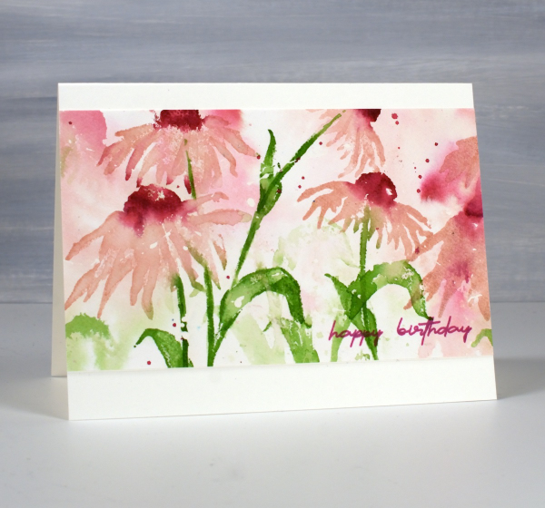
April showers bring May flowers I’ve heard so the showers we’re having today should only help bring some colour to the garden in the coming weeks. The dancing daisies stamp from Penny Black is such a beauty and I love to create a sense of movement with layered stamping.
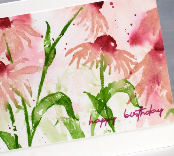
I created this panel on hot pressed watercolour paper a few years back as added inspiration for my Floral Faves online class but it was sitting in a folder not being enjoyed. I recently trimmed the ends off, turned it into a card and it is on it’s way to a friend for her birthday.
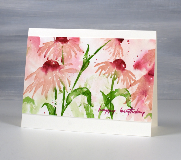
I only used three ink colours and relied on water to dilute their intensity along with second generation stamping for paler background hues. I used sweet blush, scarlet jewel and new leaf inks from Papertrey ink but you could do something similar with any watersoluble inks you have. This post includes affiliate links from Foiled Fox. If you buy through these links I receive a small commission at no extra cost to you.
Butterfly Journal Page
Posted: April 22, 2024 Filed under: gel press, grafix, Handmade book, perspective butterfly die, Tim Holtz | Tags: gel press, gel printing, grafix, Handmade book, Tim Holtz 6 Comments
It’s been ages since I posted a journal page here. I think some catching up is in order. This double spread is in my handmade 7″x 7″ journal. I did not sit down with an open journal and a plan for this page. After a productive gel printing session I had a butterfly print and a stripe and stencil print made with the same paint colours. To use them on cards I would have had to cut them up and I really didn’t want to.

When gel printing I will often print with the same handful of paint colours for a while before switching them. It makes it easier to keep printing as I have a few paint tubes on hand but more importantly I end up with a stack of prints which co-ordinate with each other because the colours and sometimes patterns are repeated.

I used the Tim Holtz ‘perspective butterfly‘ die to create a reusable duralar mask for gel printing. The circle patterns were made with the Carabelle Studio ‘accumulation de ronds’ stencil. The ‘corduroy’ looking pattern on both the butterfly and the circle page was made with a piece of textured wall paper. I completed this page quite a while ago but didn’t know if it was finished as I hadn’t added any words anywhere. Maybe that will change one day but I love it just the way it is. What you can’t see is the warm gold shimmer from the gold acrylic paint used to pull the prints.
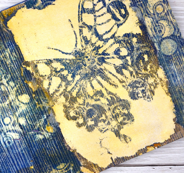
The butterfly print was on paper but the circle and stripe print was on tissue and was fairly fragile. I was able to glue most of it down successfully with gel medium but I don’t mind the ragged edges where it tore. This post includes affiliate links from Foiled Fox and Scrap’n’Stamp . If you buy through these links I receive a small commission at no extra cost to you.
Hello Leaves and Lines
Posted: April 19, 2024 Filed under: cricut, Echidna Studios, gel press, leaves and lines | Tags: cricut, Echidna Studios, gel printing, gelli plate, Penny Black creative dies 2 Comments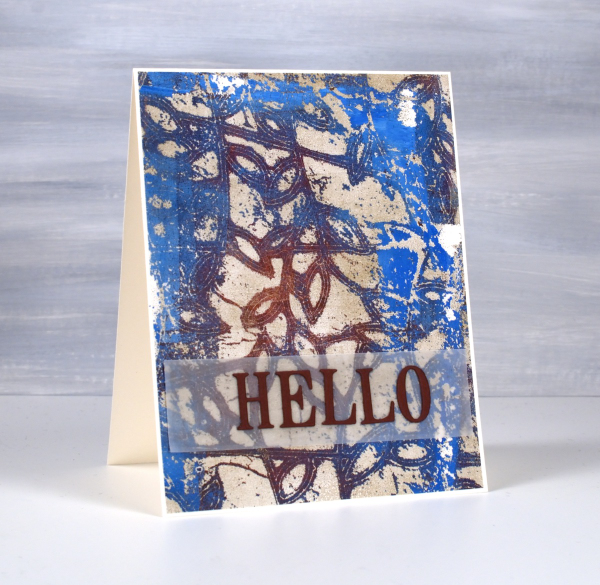
This distressed multicoloured look is one of my favourite gel printing looks. I don’t know that I could recreate it but I usually get at least a couple of these aged looking prints during a gel printing session. The pattern is achieved using a stencil laid over paint on the gel plate. This stencil is called ‘leaves and lines‘ and the digital file is available from Echidna Studios etsy store. To make today’s card I cut a 5″x 6″ stencil from Grafix matte duralar using my Cricut. I also cut it as a larger stencil which I used for a print you can see here.
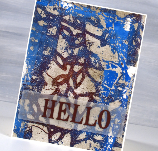
You can see on this print that I used a maroon paint and a bright blue paint; the darker blue is a mix of the two colours. I pulled the print with a pale gold paint so the surface has a bit of shimmer to it.
Because the background is very busy I placed the Penny Black ‘hello’ die-cut sentiment on a strip of vellum to stop it from getting lost in the leaves and lines. This post includes affiliate links from Foiled Fox. If you buy through these links I receive a small commission at no extra cost to you.
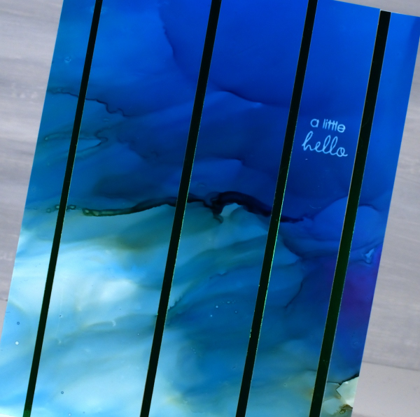
Alcohol Ink & Foil – Video
Posted: April 17, 2024 Filed under: Alcohol Ink, grafix, Penny Black, Tutorial | Tags: Alcohol Ink, grafix, grafix craft plastic, Penny Black stamps, Ranger Alcohol Ink, video 4 Comments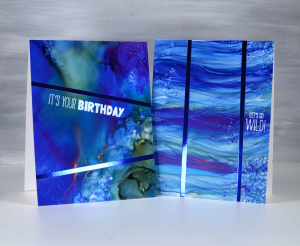
Recently I spent a happy few days creating with alcohol inks after quite a break. They did not disappoint! I am looking forward to more experimenting and maybe some Christmas card designs.
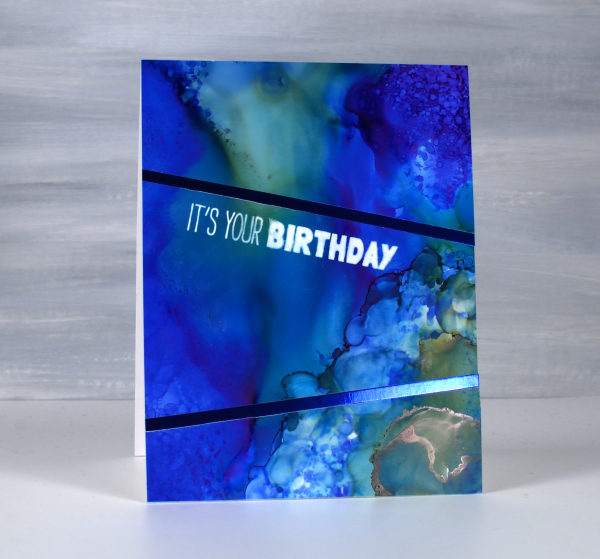
I created some cards using Grafix white craft plastic (also called bright white dura-lar), Grafix metallic foil board and Grafix double tack adhesive. These are all products I’ve used before and definitely recommend. You can see my process in the video below.

In the cards above and below you can see the wavy ocean effects I achieved easily by applying alcohol inks with a felt applicator. I love watching the inks continue to move after I lift the applicator.
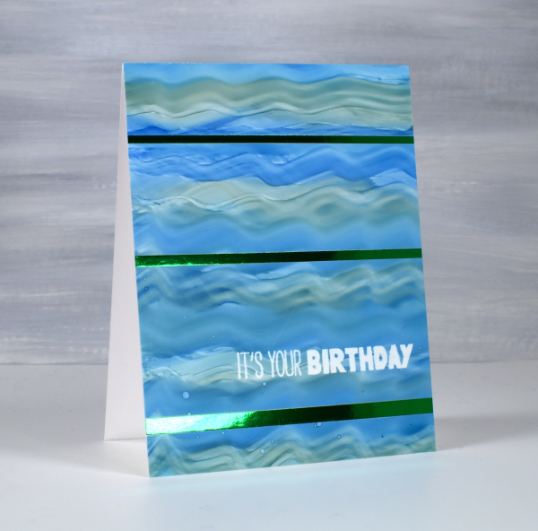
The panels below were all made by moving the alcohol inks and isopropyl alcohol around. I tilt the panel and use an air blower to move the the ink. Where there was too much of one colour or too much intensity of colour I diluted with isopropyl alcohol or just dabbed ink off the panel with a paper towel
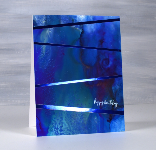
I used some of the green and the blue metallic foil board from Grafix to add to my designs. To see another project using the foil board click here.
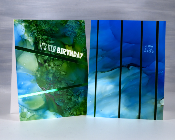
To add the sentiments I used an alcohol lift inkpad from Ranger. Its been a while since I’ve used alcohol lift ink and I was thrilled with how well it lifted the ink from the grafix white craft plastic. With a few repeat impressions and removal of diluted ink I was able to remove the bold green and blue inks to reveal sharp white words.
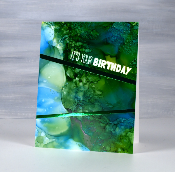
The sentiments are from the Penny Black ‘how sweet!’ set and ‘Let’s Go Wild’ set. Both are rubber cling sets which seem to hold the lift ink well and apply it evenly. This post includes affiliate links from Foiled Fox and Scrap’n’Stamp . If you buy through these links I receive a small commission at no extra cost to you.
Thriving
Posted: April 15, 2024 Filed under: Penny Black, thriving 5 Comments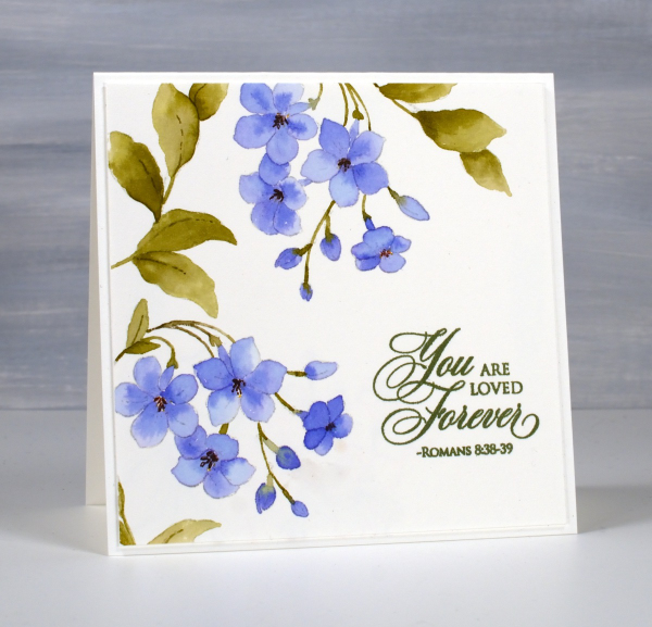
Waiting for flowers? I have two daffodils in bloom so that’s a start. These sweet blooms are from the Penny Black clear set, ‘Thriving‘. I’m not sure what the plant is although the little star shaped flowers look familiar. I used distress inks and markers and a no-line watercolour technique featured in my online class Floral Faves.
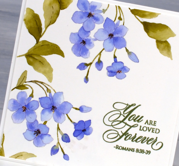
The sentiment is from the Penny Black ‘Scripture‘ set. For no-line watercolour you need a neutral dye ink which will blend in as you add other colours. I used a soft stone, a grey ink from Papertrey Ink for this panel but sometimes choose a pale beige such as distress antique linen.
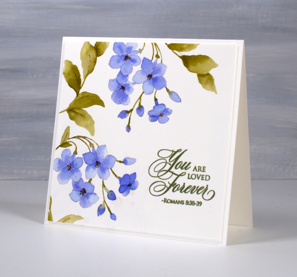
Hope something is blooming for you even if it is inside or on a card! This post includes affiliate links from Foiled Fox. If you buy through these links I receive a small commission at no extra cost to you.
The Washing Line
Posted: April 10, 2024 Filed under: City stacks, Concord & 9th, Echidna Studios, gel press, washing line | Tags: Concord & 9th, Echidna Studios, gel press, gel printing 2 Comments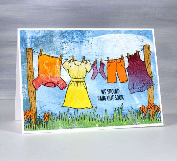
I’m not sure that this is strictly collage although it is all made from cut out papers glued together. I guess it is more like paper piecing, something I rarely do. But gel printing has me looking for all sorts of ways to use my printed papers. The ‘washing line‘ is a digital stamp from Echidna Studios and cutting out all the clothes took me way back to my paper doll days. I printed the washing line image on the seven different coloured gel prints then proceeded to pick colours for all the clothes.
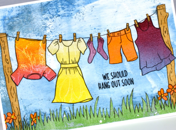
I looked through my gel prints; I have quite a few sorted into folders by colour. Most of the prints used for this panel were from my Gel Print Journey online class. The yellow dress was cut from a gradated print with a faint white daisy pattern on it. The pink and orange ‘tie dye’ was a print achieved my pressing cling wrap on the gel plate, the socks and top were from a blue & burgandy blended gel print. The blue background print was a patchy blue and white print where I hadn’t rolled off my brayer before rolling resulting in the big white blob of paint – just right for a cloudy blue sky. When it came to gluing everything onto the blue background I just adhered the cut-outs over the printed outline.
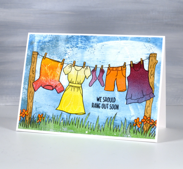
The digital image includes two patches of grass below the posts but I wanted more so I drew another strip of grass on a green gel print and filled the stretch under the washing line. I just happened to have the perfect sentiment from the Concord & 9 ‘City Stacks‘ stamp set. This post includes affiliate links from Foiled Fox. If you buy through these links I receive a small commission at no extra cost to you. If you buy from Echidna Studios my daughter and I get very excited!
Floral Collage Cards
Posted: April 8, 2024 Filed under: A Pocket Full, Collage cards, Dies, Penny Black, Taylored Expressions, this way | Tags: collage, Darkroom Door stamps, Penny Black creative dies, Penny Black stamps, Taylored Expressions 2 Comments
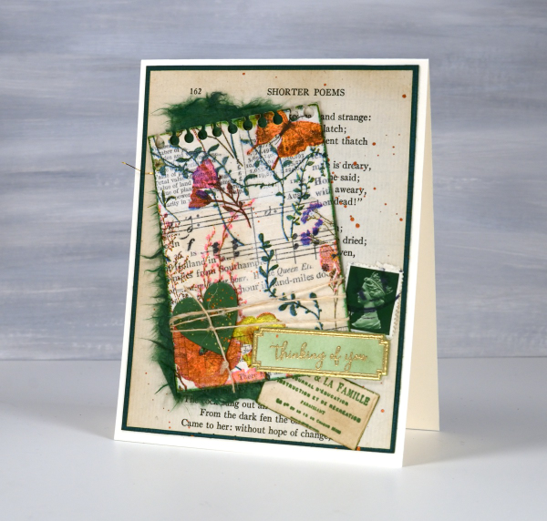
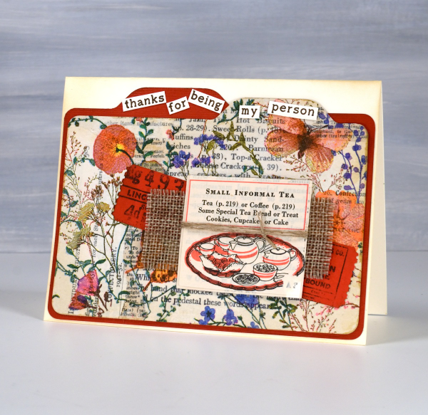
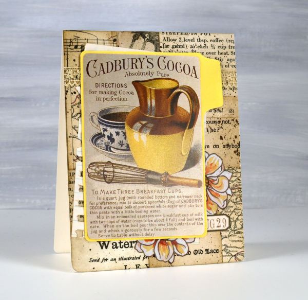
The collage and ephemera cards just keep coming. Today’s cards feature old book page collage overlaid with one layer of a floral napkin. I have a few collaged ‘mini masterboards’ made so I can cut elements or backgrounds out when I need them. For the card above I picked the rusty orange from the napkin to be the accent colour.
I recently bought a notch punch so I can create file dividers of any size; in the card above I made the blank orange one a little larger to show behind the floral & collage one. I added tickets stamped and die-cut, a scrap of hessian and a cut out from an old Betty Crocker ‘Good and Easy Cook Book‘!
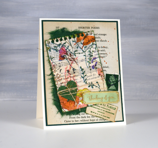
On the second card I used an aged book page as the background and added the paper napkin layer to the mini notebook page with some mulberry paper for framing and contrast. The little green postage stamp is real and the vintage label is stamped.
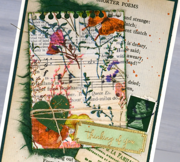
For the recent collage cards I have pulled out some supplies that I’d almost forgotten, the pretty label border stamps, the mulberry paper and the ‘office’ type dies from Penny Black are in the current rotation.
The file dividers on the card below remind me of a recipe card box which is why it ended up with the little recipe book snippet on it. The sentiment is from Taylored Expressions ‘Simple Strips – Thanks’ but I chopped it up to add to the file tabs.
This post includes affiliate links from Foiled Fox and Scrap’n’Stamp . If you buy through these links I receive a small commission at no extra cost to you.
Greenery Collage Cards
Posted: April 3, 2024 Filed under: Collage cards, Darkroom Door, Dies, Finetec paints, gift card pocket, global postmarks, Leaves, measuring tape, Mixed Media, paris postcard, Penny Black, Tim Holtz, wild flowers #1 | Tags: collage, Darkroom Door stamps, Finetec artist mica watercolour paint, Mixed Media, Penny Black creative dies, Penny Black stamps, Tim Holtz 6 Comments
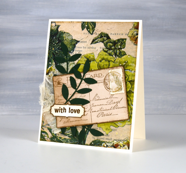
Continuing with the collage theme I have three cards featuring greenery from a paper napkin. I know people have been creating with paper napkins for years but I am new to the game. I have a small collection of pretty paper napkins to use on cards, book covers and journal pages. The green ones featured here are large dinner napkins found at Winners, probably in that tempting ‘just before the checkout’ area!

I glued the printed layer of the napkin over book pages to make my main panels and aged the edges with green and brown inks. I created a couple of little vintage postcards with the Paris postcard stamp, a background with the Measuring Tape stamp, sentiments and postmarks all from Darkroom Door.
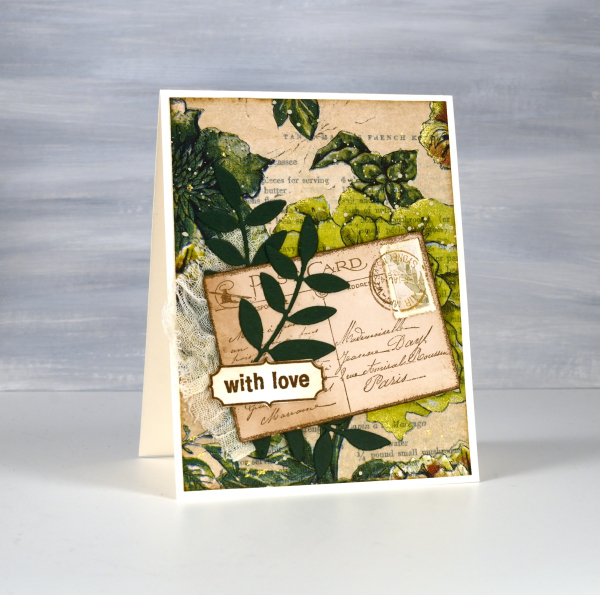
Once again I used some cute dies from Penny Black to cut tickets, file divider, tag and leaves adding blending around the edges for the vintage look.
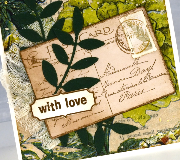
The scrap of cheesecloth, the lace and the grosgrain ribbon were all found around here, maybe the ribbon is actually vintage; it looks a bit discoloured from age which meant it co-ordinated well.

The lovely Queen Anne’s lace die is from the Tim Holtz ‘wildflowers #1 set.
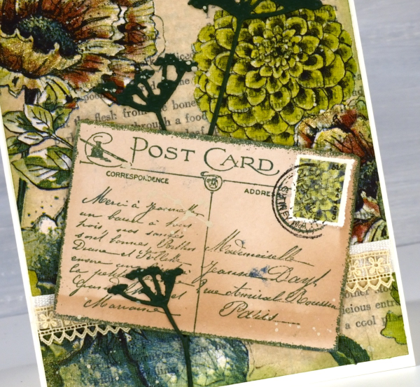
I did make my own little postage stamps for the postcards because I’m still in love with faux postage. These ones had to be quite small so I didn’t use a die I just punched tiny holes with a needle to perforate the edges. You can see a bit of splatter here and there with ivory paint and there are touches of gold watercolour paint on the petals of a few flowers too!
This post includes affiliate links from Foiled Fox and Scrap’n’Stamp . If you buy through these links I receive a small commission at no extra cost to you.
Vintage Collage Cards
Posted: April 1, 2024 Filed under: Collage cards, Darkroom Door, Dies, gift card pocket, handwritten ledger, Mixed Media, number medley, Penny Black, Tagged | Tags: Darkroom Door stamps, Mixed Media, Penny Black creative dies, Ranger archival inks 6 Comments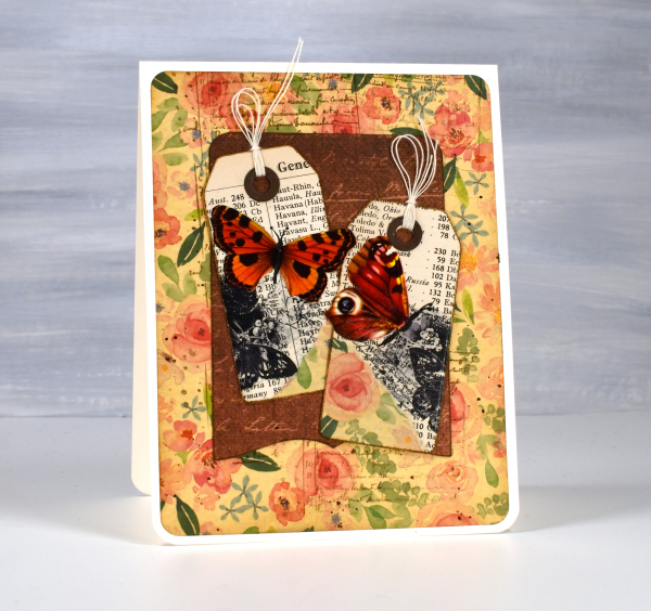
I’ve recently fallen down an vintage ephemera rabbit hole and emerged to make some of my own backgrounds and elements. There are companies that make beautiful co-ordinating ephemera, papers, chipboard pieces, etc. but I am committed to ‘using what I have’ so I’m pulling from old books, calendars, greeting cards, sewing patterns and scrapbooking paper along with a few handy tools.
I’m not going to list every die, ink or paper but I will mention some of my favourite resources. The old books that I am removing pages from include music books, dictionaries, atlases, novels, poetry and recipe books. I also have some lovely papers and vintage pages that friends have given me, so it is fun putting them to use.

The inks I reach for are the distress brown tones from Ranger, not always the dye inks, but often the archival inks as they don’t dilute or smudge when I add glue or stamp on glossy paper.

I have a bunch of background stamps and sets from Darkroom Door which give me vintage style text, patterns and elements including but not limited to the ‘handwritten ledger‘ and ‘number medley‘.

I found amongst my Penny Black dies a file folder, notebook page, several tags, tickets, pockets and decorative borders. I also treated myself to a corner rounding punch that punches in three different sizes and of course the postage stamp die set I’ve featured a few times recently.
I pulled out twine, ribbon and lace for finishing touches and some vintage butterfly cut-outs that were all joined together by little tabs. I have had them for years ever since I inherited my mother’s teaching resources. You can seem them in the close up below.

Now just in case you are worried, I am not ripping pages out of beloved old books, but I am putting to use some books I inherited and don’t have a personal attachment to. Anne, Heidi, Jo March, Jane, Ratty and Mole are all safe! Old calendars, diaries, magazines and greeting cards are fair game because honestly, I’ve held onto some of them for a very long time. This post includes affiliate links from Foiled Fox and Scrap’n’Stamp . If you buy through these links I receive a small commission at no extra cost to you.
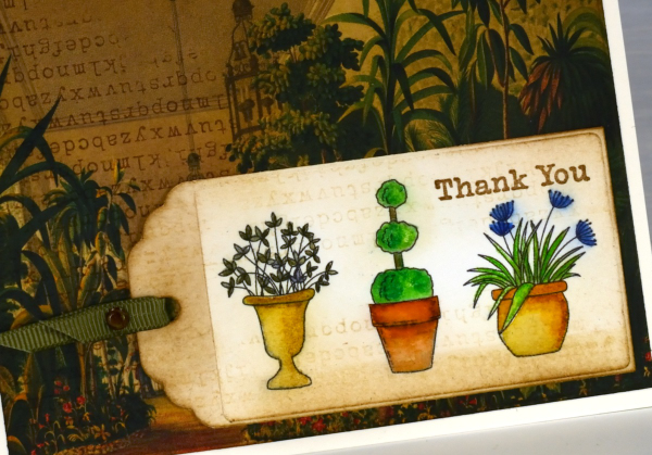
By the Garden Gate
Posted: March 28, 2024 Filed under: Echidna Studios, garden fence, Inktense pencils, Stampin Up | Tags: digital stamps, Echidna Studios, Inktense, Kuretake Zig clean color real brush markers, Stampin Up 5 Comments
The Garden Fence set is an Echidna Studios digital stamp set that I designed and my daughter digitised. The set includes a gate, three pots and a grass & flowers image. Each image is stackable which means you can arrange your own garden design with pots and gate beside each other, behind each other or even on top of each other if that sounds fun!
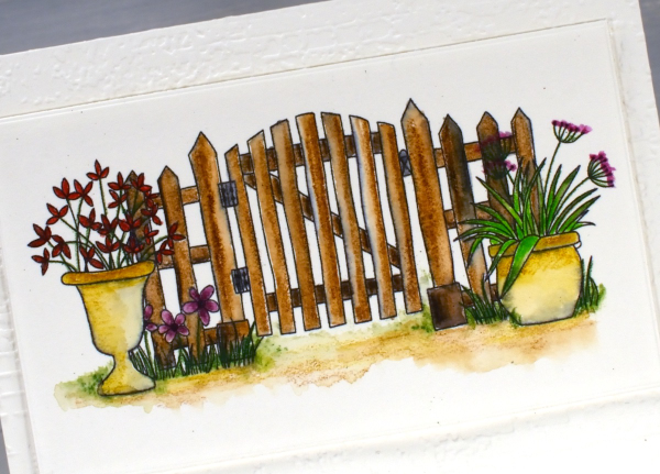
Both the gate scene above and the individual pots on the tag shown later in this post were printed on hot press watercolour paper on an ink jet printer. In the past I have always printed on a laser printer but my daughter recently bought a second hand printer to test some colour printing of our designs. We printed some black outline images to see how they were to watercolour.
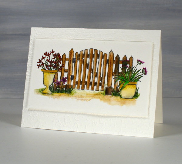
The gate design above I coloured with inktense watercolour pencils and blended the ink with water and a very fine brush. The ink from the printer did bleed a bit so you can some some grey tones here and there. Because I used very little water I was able to keep the bleeding to a minimum. I received the lovely ‘exposed brick‘ embossing folder for my birthday from a couple of friends who know just what I like. It seemed an appropriate background for the slightly aged garden gate.
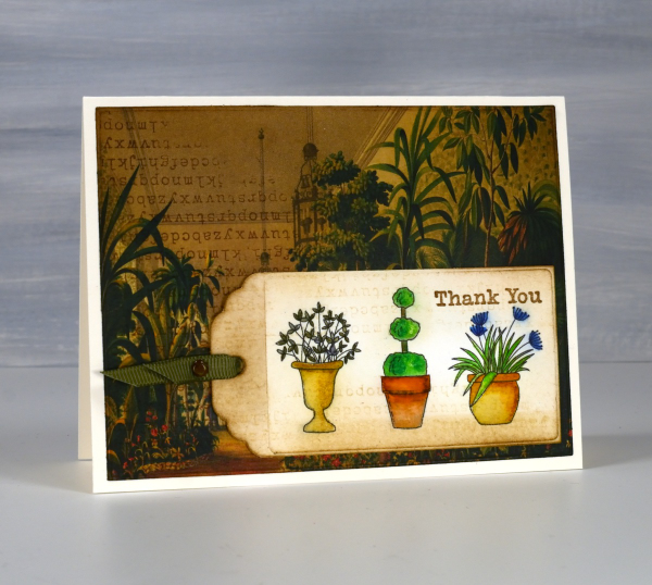
On this little tag I used a mix of inktense pencils and Zig clean color real brush markers; again there was some bleeding when I added water but no so much as to make me stop colouring and blending. All that to say if you have an ink jet printer it might be worth printing and watercolouring some images just to see how it goes.
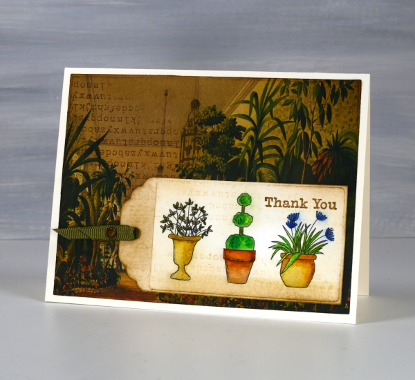
I’ve been making some vintage style collage cards lately (I’ll share them on the blog soon) so I decided to find a book page as background for my watercoloured tag. I blended vintage photo and antique linen inks around the background and tag and added some typewriter alphabet stamping on both. Unfortunately I stamped the alphabet upside down on my background but I continued with my card anyway! I like the pairing of old fashioned conservatory with modern little pots just for fun.
I’ve featured the Garden Fence set before; take a look here and here. This post includes affiliate links from Foiled Fox and Scrap’n’Stamp . If you buy through these links I receive a small commission at no extra cost to you.


